AN Mobile
The Problem
American National was established in 1905, and expanded through a merger of various local insurance companies to become the company it is today. Through the 100+ years the company has been in business, they’ve acquired customers that span generations and are used to the personalized, local service they can get from an agent they’ve known their whole lives. So, the main challenge we found with the mobile app redesign was making sure we kept the experience similar to the desktop Client Site and ensure customers can easily reach their local agent for all their needs.
june 2021
Mobile app redesign
Role: UX Designer, product owner
The Initial Brief
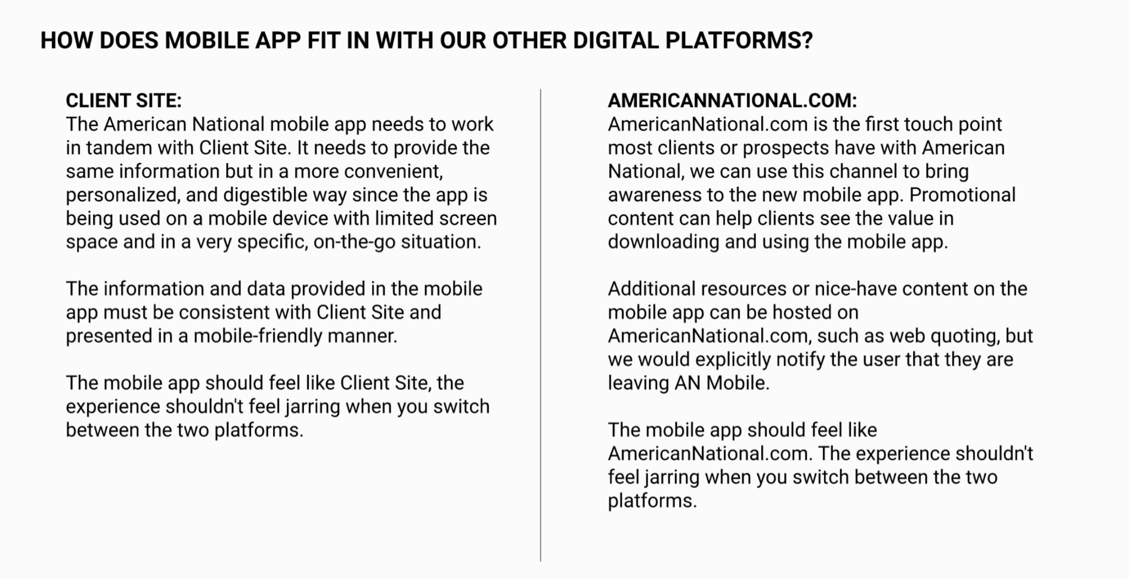
Our current digital platforms, and how AN Mobile would fit in with them
Before getting started with the redesign, the UX team had made a lot of improvements to the Client Site (our desktop portal for customers) and wanted to bring over some of those improvements to the mobile side of things. This decision came in tandem with the fact that more and more people were using mobile devices for their daily tasks and the competitive landscape in insurance had made large investments into their mobile platforms. I couldn’t remember the last time I pulled out the little cards from my glovebox, I just used the mobile ID card on my phone when I was getting my car inspected.
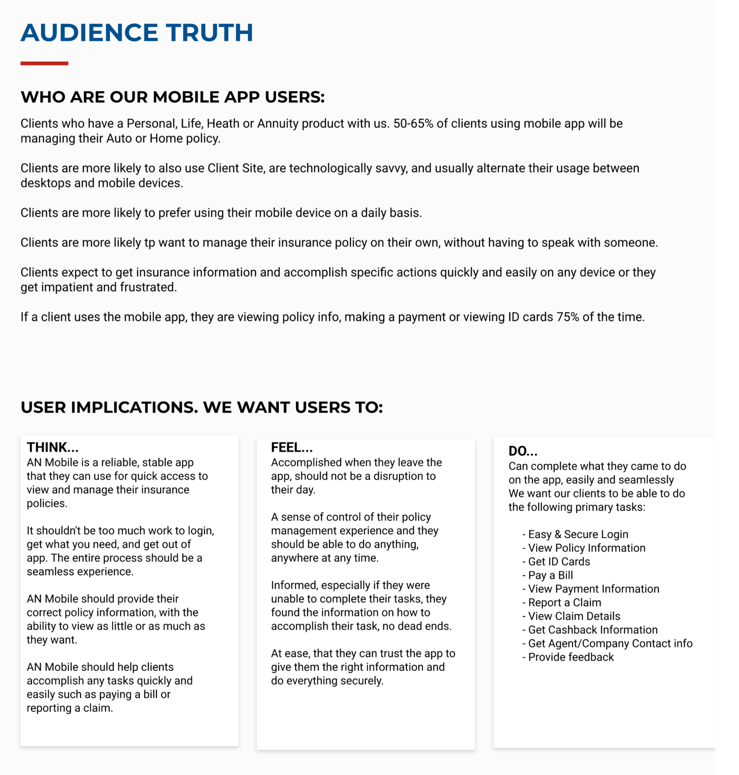
The first question was determining who the app was for. As mentioned before, a large majority of our users relied on their local agents to manage their policy, and weren’t really checking in on the site or the office everyday. They were business and farm owners who had very complicated policies they weren’t really checking in on everyday. They would speak with their agent when they needed to file a claim, and would rely on the institutional knowledge of the local offices when they had to make any changes to policies that had been in affect for years. The mobile app was designed to service the Home, Auto, and Life insurance policyholders, when they needed to check in on their policy status, documents or claims. These were the use cases most of us are used to and can be successfully serviced online without the need for an agent to have to step in.
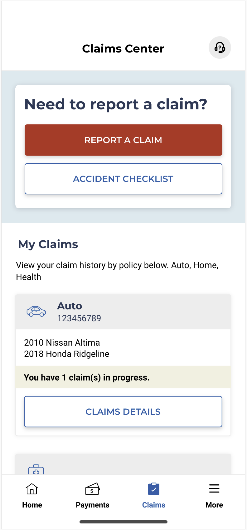
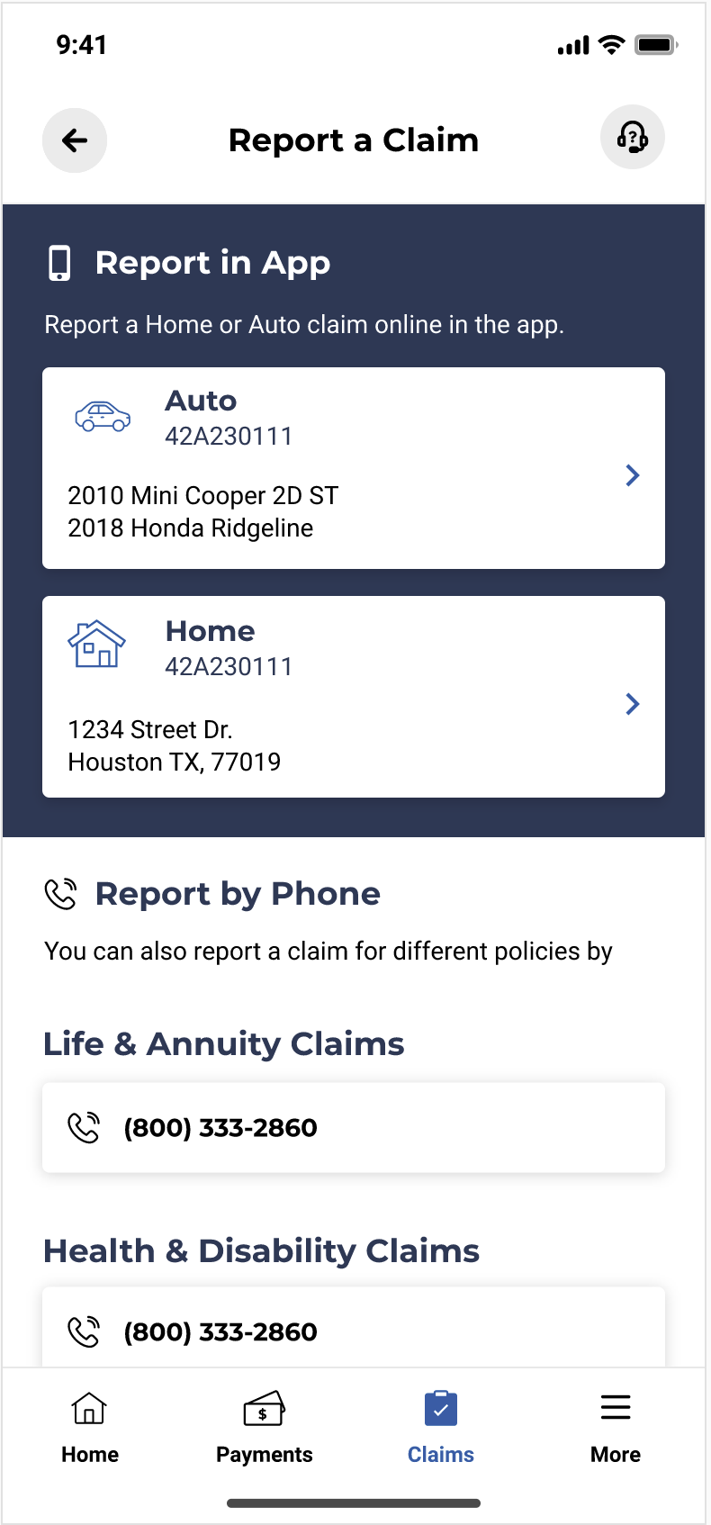
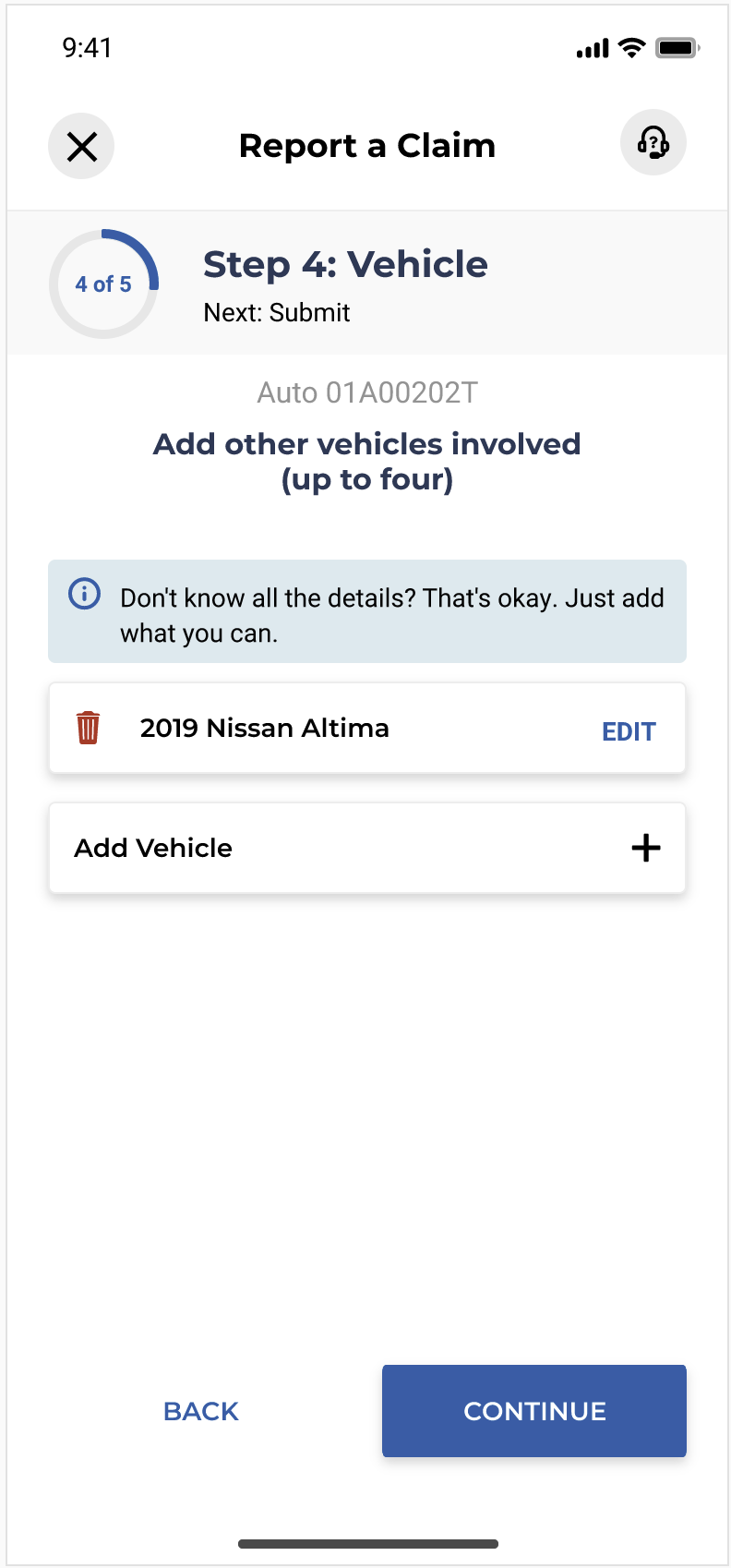
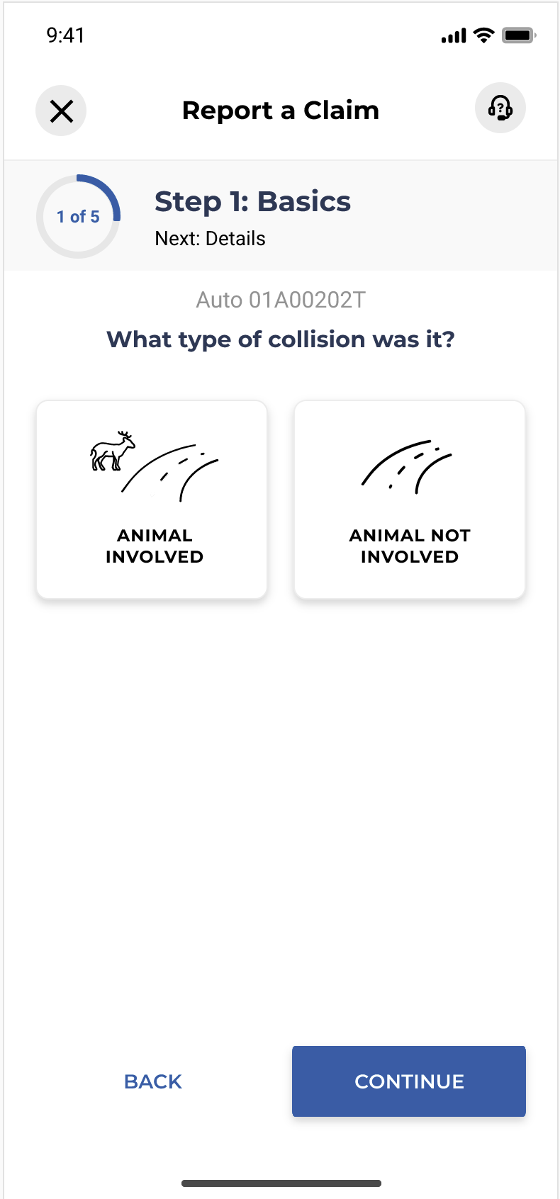
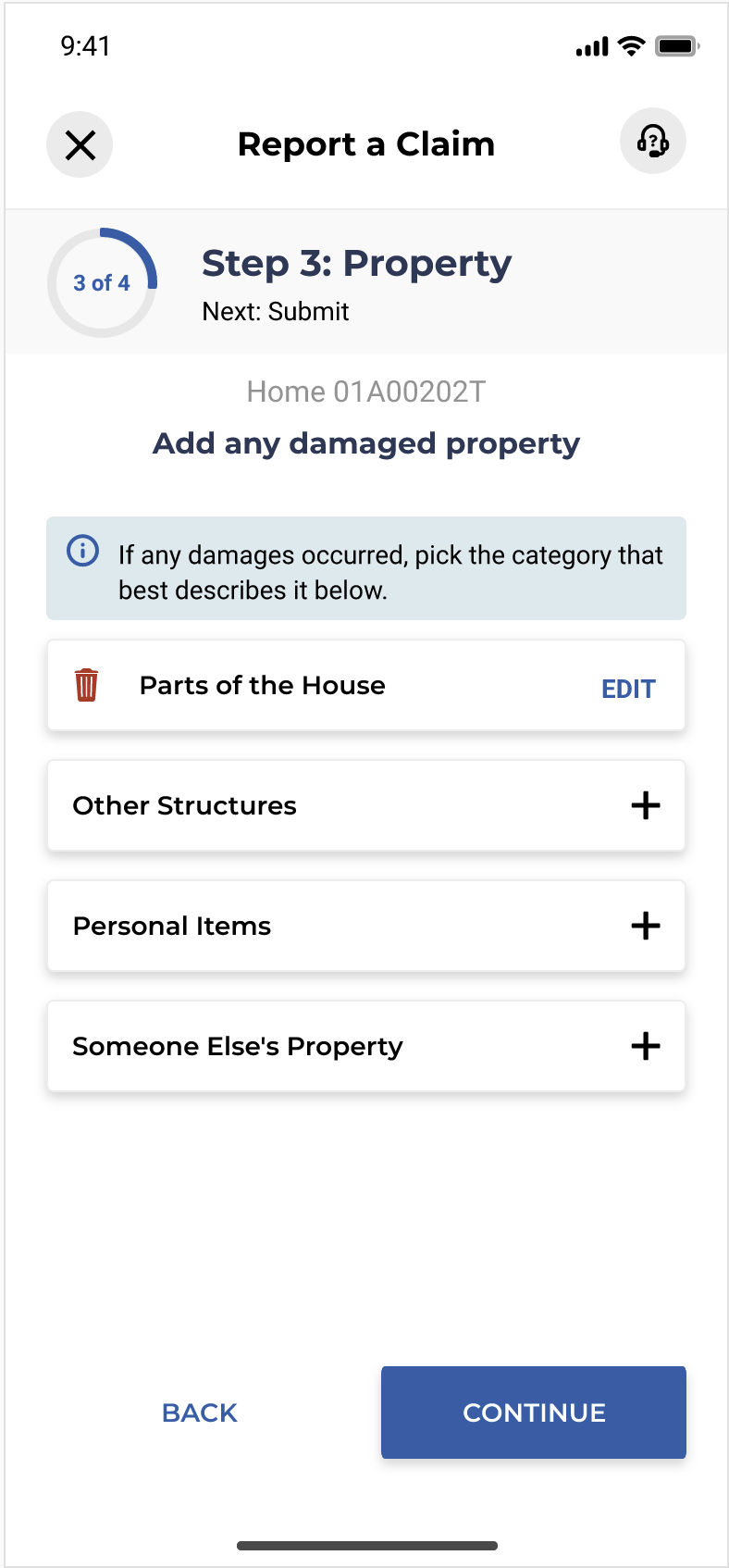
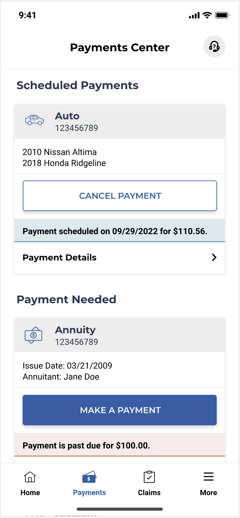
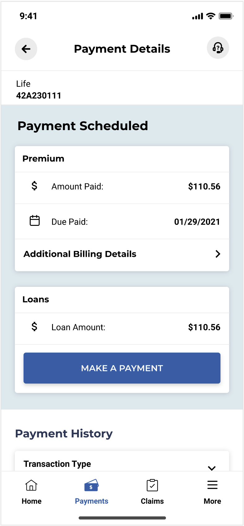
These users also were the ones using our Client Site desktop portal, and making sure they had all the features available on mobile that they had on their computer was critical to the success of the mobile app. Reporting a claim was an important process that we currently only had on the Client Site that was necessary to have on mobile.
Some notes from our preliminary competitive analysis
The source of truth for our design process, this would guide what we built
Feature Design
The mobile insurance app market is highly competitive, with established national brands already providing mature offerings. Our objective was to bring AN Mobile up to that standard and matching their capabilities, while keeping our stakeholders’ priorities central.
We needed to add in the features that our users were taking advantage of in the Client Site and also add new features that are mobile specific, like Biometric login and mobile ID cards.
I worked with our development team to plan out the new features, and what it would take to update the current ones to the new design.
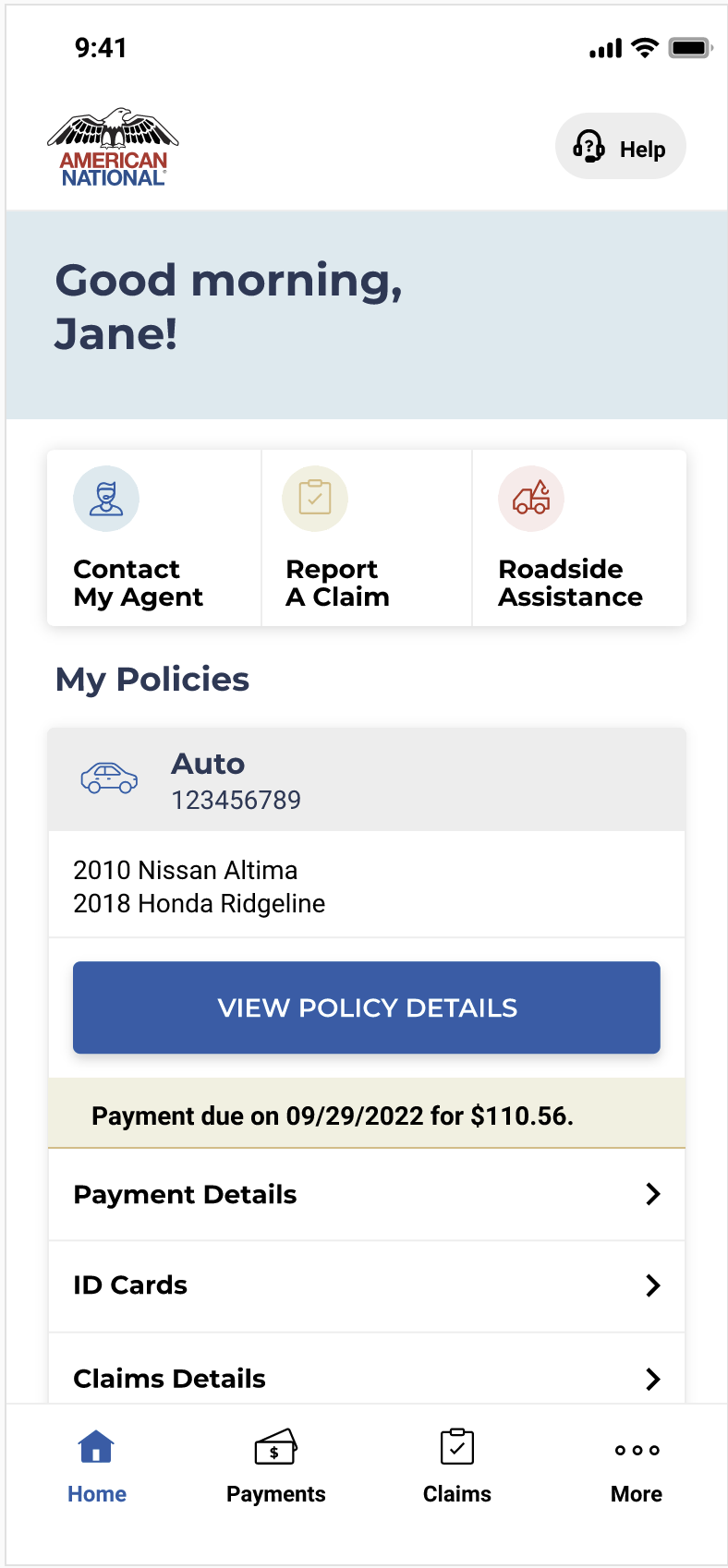
Final Design
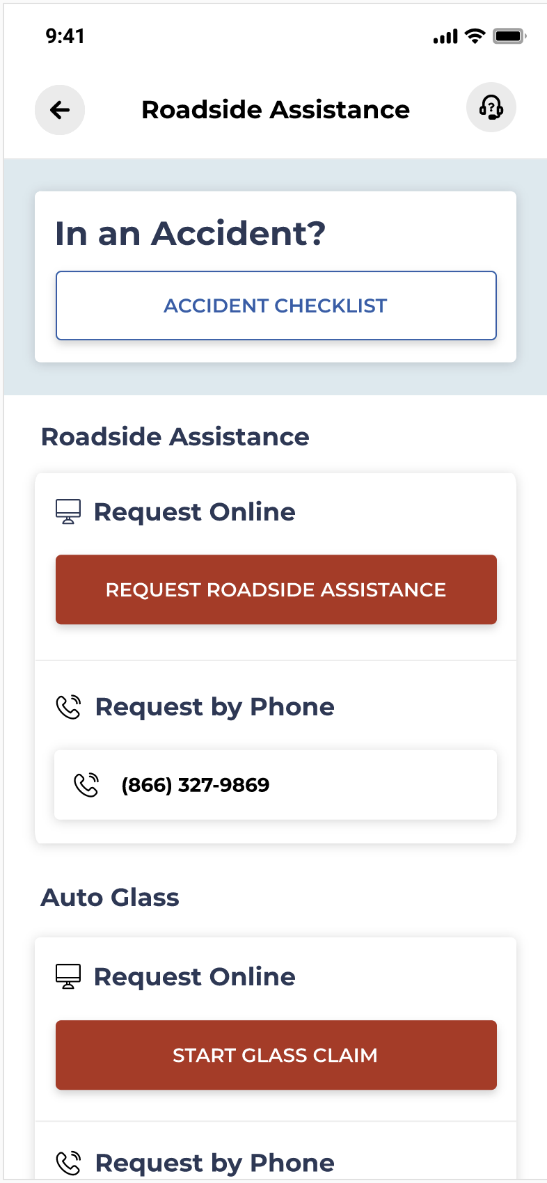
I worked along with our talented UI Designer, Justin, to translate our wireframes into a beautiful experience that incorporated the American National brand and design language. Some of the features that we were proud of were the clear process for reporting a claim and the comprehensive Roadside Assistance page, two features that are vital on a cell phone.