UC San Diego Mobile Redesign
Problem
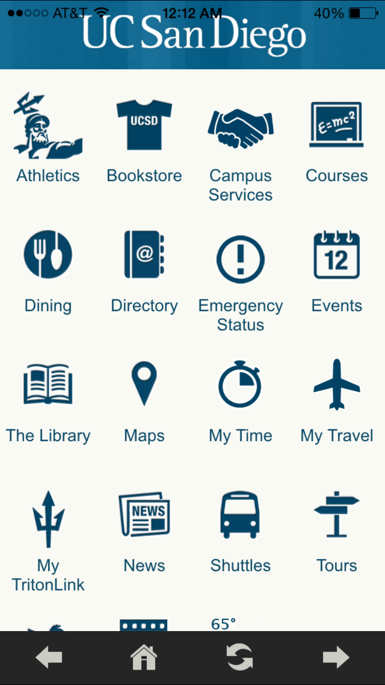
The UC San Diego mobile app has a lot of useful resources that I found invaluable during my time there, but the design was a bit dated and, at times, hard to use. I found myself using the mobile site much more than the mobile app, so I decided to tackle a redesign on the home screen.
August 2015
Mobile App Redesign
Role: UX Designer
Before
AFter
The new design simplifies the home screen significantly and provides the most important options for students and visitors to the campus. The MyTritonLink login is placed in the center of the screen so students who would like to view their campus account on mobile can immediately access it without having to waste any time.
The extra icons that were on the old home screen will be organized within the main categories on the homepage. The other options that are less frequently used will be located within the drop down menu which can be accessed from the top left of the screen.


